
Seeing Green, Feeling Red: Colour Trends That Are Redefining the Modern Sydney Home
, by Magico Home, 5 min reading time
, by Magico Home, 5 min reading time
Sydney’s interiors are entering a new emotional era. For nearly a decade, minimalist whites, beige tones and safe neutrals dominated homes across the city, promising calm but often leaving spaces feeling sterile and disconnected. Now, colour is making a considered comeback—not as decoration, but as expression.
Across Sydney’s terraces, apartments and coastal homes, the palette of 2025 is richer, braver, and more personal. From serene sage greens to the confident glow of cherry red, and the immersive drama of colour-drenched rooms, homeowners are embracing colour as a way to build warmth, individuality, and emotional depth.
At Magico, we see this not as a fleeting design movement, but as a reflection of shifting values. Colour has become a language of self-expression, connection, and joy—a reminder that home is not a showroom, but a living organism.

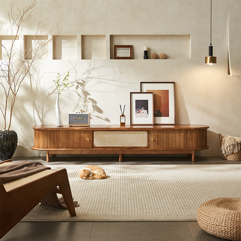
1.Seeing Green: The Rebirth of Calm
Few colours capture Australia’s natural rhythm like green. From the silvery greens of eucalyptus leaves to the deeper tones of rainforest canopies, these hues feel deeply at home under Sydney’s abundant daylight.
Every shade tells a different story:
•Sage green evokes mindfulness and softness—a perfect choice for living spaces or bedrooms.
•Olive and khaki add grounded warmth, working beautifully with timber floors or brushed brass.
•Forest green offers quiet sophistication for darker, moody interiors that still feel natural and layered.
Why Green Now?
In a city defined by its connection to nature—its beaches, bushland, and open light—it’s natural that Sydney residents are seeking harmony indoors. Green offers psychological calm; it balances technology, offsets the intensity of glass and metal, and creates a space that breathes.
Designers are embracing green in new ways: matte sage cabinetry paired with stone benchtops, deep green velvet armchairs in coastal living rooms, or eucalyptus walls that complement neutral linen sofas. When used in combination with tactile materials like travertine, oak, or jute, the result feels organic and timeless.
Expert Tip from Magico
For those cautious about commitment, begin with accents—a linen throw, a ceramic lamp base, or a single feature wall. For the bold, consider full colour immersion: painting walls, trims, and even ceilings in one muted tone for a cocooning calm that feels architectural rather than decorative.
The green revival isn’t about trend—it’s about mindfulness. It’s the palette of people who value quiet, comfort, and connection to the natural world.

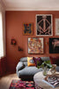
2.The Rise of Cherry Lacquer: Bold, Warm, and Irresistibly Human
If green is the colour of balance, cherry red is the colour of emotion. Every few years, one hue captures a cultural mood; for 2025, cherry red leads the conversation.
This is not the glossy, artificial red of the 2000s. It’s cherry lacquer—deep, warm, and tactile. Think of the rich finish of vintage cars or mid-century enamel cabinets, softened by light. It’s vibrant, but with maturity.
The “Unexpected Red Theory”
A growing design philosophy argues that a single touch of red can transform an entire space. The theory, now trending across Europe and Australia, suggests that red works anywhere—as long as it’s used with intention.
Picture a crimson lamp base against a neutral wall, a cherry-red armchair framed by muted curtains, or a lacquered sideboard glowing in afternoon light. Each creates a pulse point—a sense of heart and warmth that pulls the eye and stirs emotion.

Under Sydney’s natural coastal light, cherry red behaves differently than it does in northern climates. It feels sun-warmed and lively rather than heavy or dramatic. Pair it with:
•Off-white walls and natural oak for balance
•Brushed brass accents to add warmth
•Cool greys or sage greens for contrast
Used sparingly, red adds soul. Used boldly, it creates a signature. Either way, it reminds us that design should make us feel, not just look.
3.Beyond an Accent Wall: The Power of Colour Drenching
After decades of feature walls, the design world has moved toward something more immersive—Colour Drenching. This approach involves painting walls, doors, trims, ceilings, and even cabinetry in a single shade, enveloping the space in colour.
When done well, it doesn’t overwhelm—it harmonises. It creates a visual unity that feels cocooning, serene, and deeply intentional.
Why It Works
In homes with open layouts (common across Sydney’s inner suburbs and beachside apartments), Colour Drenching helps define zones and mood without the need for partitions. A consistent hue can soften transitions, blur boundaries, and create a sense of architectural rhythm.
Designers often recommend muted, low-chroma tones for this approach—sage, sand, stone, charcoal, blush, or taupe. These colours absorb natural light gently, creating depth without heaviness. Texture is key: matte finishes, linen upholstery, and natural timber prevent monotony.

Local Insight
Colour Drenching resonates especially well in Sydney because of its luminous light quality. Unlike cities with colder climates, Sydney’s sunlight enhances texture and dimension, making even darker hues feel breathable.
At Magico, we see this technique as a statement of confidence. A colour-drenched room doesn’t whisper trend—it speaks consistency. It’s design stripped of noise, where every surface tells the same story.
Designing Emotion: The Palette of the Future
In 2025, Sydney interiors are rediscovering emotional authenticity. Green offers tranquility, red delivers warmth, and immersive monochrome builds coherence. Together, they form a modern palette that feels human—less about perfection, more about presence.
At Magico, we believe colour is more than pigment—it’s psychology. It shapes how we rest, interact, and recharge. Whether through the calming depth of sage or the unapologetic boldness of cherry lacquer, these hues allow our homes to reflect who we are becoming: calm, confident, and unafraid to express emotion.
Colour isn’t just decoration—it’s dialogue. It connects us to our space, to one another, and to ourselves. And that, above all, is what makes a home truly alive.


Subscribe to our emails