
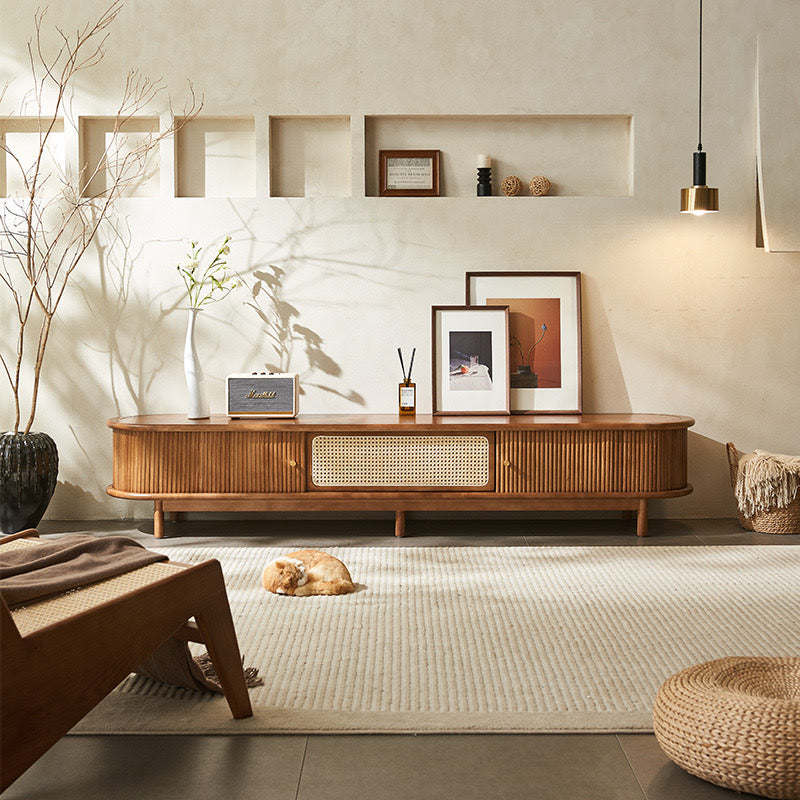
2026 Colour Trend Dispatch5 Professional Ways to Use Butter Yellow in Your Home
, by Magico Home, 4 min reading time
, by Magico Home, 4 min reading time
As we move into 2026, global colour forecasting points toward calmer, softer neutrals, with Pantone’s Cloud Dancer signalling a collective desire for balance and visual ease. Against this backdrop, butter yellow continues to hold its place as a refined, versatile accent — not loud or playful, but warm, optimistic and grounded.
At Magico, we view butter yellow not as a passing trend, but as a supporting colour: one that enhances texture, materiality and light, particularly in Australian homes where natural sunlight plays a defining role. Below are five considered, design-led ways to incorporate butter yellow into your interior — tailored for Sydney living and contemporary Australian lifestyles.
1. Use butter yellow on feature walls — with light and finish in mind
A butter yellow feature wall is most effective when it works with the home’s natural light rather than competing with it. In Sydney apartments with strong northern exposure, Magico recommends a low-sheen eggshell or velvet matte finish to reduce glare and maintain depth throughout the day.
For smaller spaces, a single wall behind a sofa or bed creates warmth without visual crowding. In larger open-plan layouts, butter yellow can be used on two adjacent walls or architectural recesses to gently define zones while maintaining cohesion.

Magico design note:
Always test colour samples on multiple walls and observe them at different times of day. Butter yellow can read creamy in morning light and more ochre-toned in the afternoon — both desirable effects when planned correctly.
2. Commit through upholstery — choose performance and longevity
Butter yellow upholstery works best when paired with clean silhouettes and high-performance fabrics. A sofa or accent chair in this tone becomes a focal point, particularly when set against neutral flooring and textured walls.
At Magico, we favour butter yellow in solution-dyed acrylics or premium performance polyesters, offering resistance to UV fading, humidity and everyday wear — essential for Australian homes with large windows or family living zones.
To maintain a timeless feel, opt for butter yellow variants with a slightly muted, warm undertone rather than bright lemon hues.
3. Introduce butter yellow in kitchens — balance with natural materials
In kitchens, butter yellow is most effective when grounded by timber, stone or deep neutral finishes. Rather than applying it everywhere, consider using it on lower cabinetry, island panels or open shelving, while keeping upper cabinetry light and restrained.
For Sydney homes, Magico recommends pairing butter yellow cabinetry with:
•Natural oak or walnut joinery
•Honed stone benchtops
•Soft green or warm grey splashbacks
This approach delivers warmth and personality without overwhelming the space or dating it prematurely.

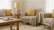
4. Start with soft furnishings and accents — the most flexible option
For homeowners wanting to explore the trend with minimal commitment, butter yellow accessories offer immediate impact. Cushions, rugs, throws, lampshades and ceramics introduce colour while remaining easy to update seasonally.
Magico frequently uses butter yellow accents in styling to soften neutral rooms and add a sense of optimism — particularly effective in living rooms, bedrooms and entry spaces.
Retail insight:
Accessories are often where Australian customers first engage with a colour trend. Styling butter yellow products alongside warm neutrals and textured materials helps customers visualise them in real homes.
5. Apply butter yellow outdoors — with UV stability in focus
Sydney’s climate makes outdoor living a priority, and butter yellow translates beautifully into alfresco settings when used thoughtfully. Umbrella canopies, outdoor cushions and tableware accents are ideal applications, while furniture frames should remain neutral for longevity.
At Magico, we recommend UV-stable, solution-dyed outdoor fabrics to prevent fading and ensure colour consistency over time. Butter yellow works especially well against teak, charcoal aluminium and woven outdoor materials.
Outdoor guideline:
Avoid large painted exterior surfaces in yellow unless marine-grade coatings are used. Soft furnishings allow for easier updates as trends evolve.

A final word from Magico:Recommended pairings for 2026 interiors
Butter yellow performs best when paired with tones that add depth and restraint:
Butter yellow + olive or sage green — biophilic and calming
Butter yellow + aubergine or deep plum — contemporary and dramatic
Butter yellow + terracotta or walnut — warm, grounded and timeless
For best results, Magico advises selecting butter yellow shades that sit closer to warm cream or soft ochre, ensuring they remain elegant across varying light conditions.
At Magico, we approach colour trends through the lens of longevity and liveability. Butter yellow is not about chasing fashion, but about creating interiors that feel welcoming, optimistic and distinctly Australian.

Subscribe to our emails